How to Change the Position of a Content Container on Mobile in Shopify
Introduction
In the world of eCommerce, the mobile user experience is as crucial as the desktop experience. One frequent issue many Shopify store owners face is the incorrect positioning of content containers, such as image banners, on mobile layouts. This guide will walk you through how to reposition a content container on your Shopify store, identifying potential causes and providing step-by-step instructions to resolve the issue.
Understanding the Problem
What is a Content Container?
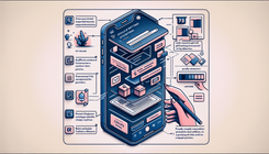
A content container in web design is an HTML element that houses other elements like text, images, and buttons. On Shopify, these containers might hold promotional banners, product displays, or other forms of content.
Common Issues with Content Containers on Mobile
The primary issue with content containers on mobile devices is their position not aligning as intended. This misalignment can affect the overall user experience, reducing engagement and conversions. The main reasons behind this problem can include:
- CSS Breakpoints: Different styles can be applied based on screen size through CSS media queries, but sometimes the breakpoints need to be better set, causing mispositioning.
- Theme Limitations: Some Shopify themes may not offer adequate customization options for mobile layouts.
- Custom Code Conflicts: If custom CSS or JavaScript is added to the theme, it can sometimes conflict with default styles, causing content containers to misalign.
Step-by-Step Guide to Changing Content Container Position on Mobile
Step 1: Accessing the Admin Page
- Login to Your Shopify Admin: Start by logging into your Shopify Admin page using your credentials.
- Navigate to Online Store > Themes: In the left-hand side menu, go to the ‘Online Store’ option and then click on ‘Themes’.
Step 2: Editing the CSS File
- Select the Theme: Choose the theme you want to edit from your list of installed themes.
- Open the CSS File: Under the ‘Asset’ folder, find the CSS file that contains your custom styles. This file could be named
main.css,base.css,style.css,theme.css, or similar. - Scroll to the Bottom: Scroll to the bottom of the selected CSS file to add new styles.
Step 3: Adding the Custom CSS
Insert the following CSS code at the very bottom of your CSS file:
@media screen and (max-width: 749px) {
  .banner__box.content-container.content-container--full-width-mobile {
    position: absolute;
    top: 20%;
  }
}
This CSS code uses a media query to apply the styles only to screens with a maximum width of 749 pixels. The position: absolute; and top: 20%; properties adjust the position of the .banner__box.content-container.content-container--full-width-mobile element.
Step 4: Saving the Changes
- Save the F̥ile: Make sure to save the changes to your CSS file by clicking on the 'Save' button.
- Preview the Changes: Preview your Shopify store on a mobile device or by resizing your browser window to confirm that the content container’s position has changed as expected.
Additional Tips and Troubleshooting
Testing Multiple Devices
Make sure to test the changes on multiple mobile devices to ensure the new positioning works across different screen sizes and resolutions.
Using Developer Tools
Browser developer tools can be very helpful when diagnosing issues. Use the ‘Inspect’ tool to check the CSS applied to elements and to test changes live before editing your CSS file permanently.
Reverting Changes
If the changes do not produce the desired effect, you can always revert to the previous version of your CSS file. Make sure to backup the original code before making changes.
Frequently Asked Questions
Q1: How can I center a content container horizontally and vertically on mobile?
To center a content container both horizontally and vertically, you can use flexbox properties in your CSS:
@media screen and (max-width: 749px) {
  .banner__box.content-container.content-container--full-width-mobile {
    display: flex;
    justify-content: center;
    align-items: center;
    height: 100vh;
  }
}
Q2: What if my theme doesn’t have a CSS file?
If your theme doesn’t seem to have a CSS file, it might be using a different structure, such as SCSS or another preprocessor, or the styles could be embedded directly in another section. In such cases, consulting your theme’s documentation or contacting Shopify support can provide clarity.
Conclusion
Shifting the position of a content container on mobile devices within your Shopify store is essential for maintaining an optimal user experience. By carefully adding the correct CSS media queries and style properties, you can easily reposition content to enhance usability and aesthetics on mobile devices. Remember to test your changes across different devices and refer to these guidelines as needed to maintain a professional and user-friendly online store.


