Removing White Space Under and Above Image Banner in Shopify Dawn Theme on Mobile Only
Understanding the Issue of White Space in Shopify Dawn Theme
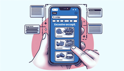
White space in web design is a crucial element that helps break up the page and enhances readability. However, excessive white space, especially around image banners, can detract from the aesthetics of your eCommerce store, particularly on mobile devices. When using Shopify's Dawn theme, many store owners notice unwanted white space above and below image banners on mobile view, which can affect the overall look and feel of the site.
Causes of Excessive White Space Above and Below Image Banners
Understanding the reasons behind this issue can help you address it effectively. Here are some common causes:
- Theme Padding and Margin Settings: The Dawn theme might have default padding and margin settings that create extra space around your image banners.
- Banner Image Aspect Ratio: Mobile devices have different aspect ratios compared to desktops, which can lead to white space when the image dimensions do not adapt properly.
- Custom CSS Overrides: Previous customizations or additional CSS code might interfere with the default settings, causing unintended white space.
- Container Dimensions: The containers holding the image banners might have set dimensions that do not scale well on mobile devices.
Step-by-Step Guide to Remove White Space
Below is a comprehensive guide to address and remove the unwanted white space in Dawn theme specifically for mobile view.
Step 1: Identify the Source of White Space
First, inspect your website using the browser's developer tools to pinpoint where the white space originates. On most browsers, you can right-click and select “Inspect” or press Ctrl+Shift+I (Command+Option+I on Mac) to open Developer Tools.
Step 2: Modify Theme Settings
Check your theme settings within Shopify to see if there are options to adjust the padding and margins specifically for mobile views.
- Log in to Shopify Admin.
- Go to Online Store > Themes.
- Click on Customize next to the Dawn theme.
- Navigate to the Sections and select the Image Banner section.
- Look for settings related to padding and margins.
- Adjust the settings to reduce or remove the white space.
Step 3: Add Custom CSS For Mobile View
If the theme settings do not provide enough control, you can add custom CSS to target mobile devices.
- Go to Online Store > Themes in your Shopify Admin.
- Click on the Actions dropdown and select Edit Code.
- Locate the
theme.scss.liquidor relevant stylesheet in the Assets folder. - Add the following CSS code:
@media only screen and (max-width: 768px) {
  .image-banner-wrapper {
    margin-top: 0 !important;
    margin-bottom: 0 !important;
    padding-top: 0 !important;
    padding-bottom: 0 !important;
  }
}
Save the changes and preview your store on a mobile device to see if the white space issue is resolved.
Step 4: Verify Your Changes
After making the adjustments, thoroughly test your store on different mobile devices to ensure the changes look good across various screen sizes. It's essential to check both portrait and landscape orientations.
Step 5: Optimize Banner Images
Optimizing your banner images can also help in reducing unwanted white space. Ensure that the dimensions and aspect ratios are suitable for mobile devices. Use responsive images that adapt based on the screen size.
- Use a Responsive Design: Employ CSS media queries to serve different image sizes for different devices.
@media only screen and (max-width: 768px) {
  .image-banner {
    background-size: cover;
    background-position: center;
  }
}
- Test Image Quality: Compress images without losing quality to ensure fast loading times which enhance overall user experience.
Frequently Asked Questions
Why is there white space around my image banners on mobile devices?
The white space usually appears due to default theme padding/margin settings, improper image aspect ratios on mobile screens, or custom CSS that affects banner display.
Can I remove the white space without coding?
Yes, you can adjust settings in the Shopify theme customizer. If that doesn't fully address the problem, adding custom CSS will provide more precise control.
Will these changes affect the desktop view?
No, the custom CSS provided targets mobile devices only using media queries, ensuring that the desktop view remains unaffected.
Conclusion
Removing white space above and below image banners in your Shopify Dawn theme for mobile devices can significantly improve your site's visual appeal and user experience. By understanding the causes and following the aforementioned steps, you can effectively manage and eliminate this issue. Remember to test your changes across various devices to ensure consistency and optimal appearance.


