Introduction
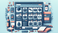
Running a successful eCommerce store requires more than just listing products and hoping they sell themselves. A big part of ensuring your customers have a smooth shopping experience is presenting product details in an organized and visually appealing manner. One detail that often gets overlooked—but can profoundly affect clarity and user experience—is the alignment of the product price box on your collection pages. If a potential shopper has difficulty parsing your product listings because the price boxes look disorganized or misaligned, they might hesitate or even abandon your store altogether.
In this BemeApps guide, we’ll walk you through the process of aligning the price box on Shopify’s Broadcast theme. Whether you’ve just installed the Broadcast theme recently or you’ve had it running for a while, maintaining consistent alignment across your products’ price tags can enhance the sense of professionalism and polish on your site. We’ll delve deep into the reasons or causes behind misalignments, explore some common scenarios, and provide comprehensive solutions for each. By the end, you’ll have a thorough understanding of CSS tweaks, theme customization approaches, and best practices to keep your store’s design forward-thinking.
We will also discuss ways to further showcase or highlight your store’s products using third-party apps, as well as how you can integrate advanced Shopify features like Hydrogen for an even more dynamic, high-performing storefront. Let’s jump right in.
Identifying the Problem: Why Are Price Boxes Misaligned?
While Shopify provides an excellent framework for designing modern online stores, issues can arise when theme-specific styles override the default layout or when customizations are made incorrectly. Specifically, with the Broadcast theme, you might notice that the product price boxes on the collection pages don’t line up evenly. There are multiple reasons for this:
- Varying Product Titles: If certain product names spill into multiple lines while others remain on a single line, the price boxes below can start to shift vertically.
- Theme CSS Conflicts: Each theme has its own set of CSS rules. When you apply custom CSS to your theme, or an app injects its styles, these can clash with existing classes and cause alignment issues.
- Image Ratios and Heights: Sometimes product images are displayed at different heights, especially if you’re uploading images of different dimensions or aspect ratios. This can push the product information container up or down, disturbing the alignment of the price boxes.
- Inconsistent Formatting for Product Collections: If you display multiple collections differently, some might display product vendor names, sub-descriptions, or promotional badges (like “Sale” or “New”), causing uneven spacing above or below the product price lines.
- Theme Updates: When your theme updates, it might overwrite specific CSS adjustments you had in place. Overwriting can also happen with conflicting code added elsewhere in the theme.
Understanding the source of the misalignment is crucial because it informs how we can fix the issue. Sometimes, a simple update to product titles might be enough. Other times, more elaborate CSS or structural changes are needed.
Reasons and Causes of Similar Problems
Price box alignment issues are not unique to the Broadcast theme. Any Shopify theme can develop these quirks if certain style overrides or structural changes are introduced. Some broader reasons include:
- HTML Structure Alterations: When advanced custom code changes the HTML architecture, the typical styling might no longer apply correctly.
- Third-Party Apps and Scripts: Apps that inject additional blocks or badges into the product list can shift previously uniform elements.
- Lack of Standardized Image Sizes: Inconsistent image dimensions cause the product details below to move up or down.
- Excessive Spaces or Hidden Elements: Overly large margins or padding can push other elements out of line, or hidden sections (like variant pickers that appear only on hover) can shift the layout.
The best approach is to focus on standardizing how your product listings appear and ensuring consistency in images, titles, and descriptions. With those aspects calibrated, your final step is a small CSS fix that locks the design in place. Let’s dive into how we can solve it.
Detailed Guide to Solve the Problem
Step 1: Confirm Your Theme and Backup Your Current Settings
Before trying any CSS fix or code injection, always confirm your theme’s version and ensure you have a reliable backup of your current settings.
- Check Your Theme: Navigate to your Shopify Admin → Online Store → Themes. Confirm that you’re indeed using the Broadcast theme.
- Duplicate Your Theme: It’s best practice to duplicate your theme before making major changes. In the ‘Actions��’ dropdown for your published theme, click ‘Duplicate.’ This backup will help you revert changes if you encounter issues.
Step 2: Standardize Your Product Titles
One of the most common culprits is how many lines your product titles span. Aligning the height of each product’s textual area ensures that the price boxes will follow suit on the next row.
- Shorten Excessively Long Titles: If your product name is extremely long, consider abbreviating it. For instance, if your product title is "Organic, Locally-Sourced, Hand-Ground Almond Butter 250g," you could rename it to "Organic Almond Butter 250g" or "Locally-Sourced Almond Butter." The shorter title prevents line breaks.
- Consistent Title Lengths: Attempt to keep product names around the same number of characters, if practical. This is more of a design best practice, rather than a strict rule, but it helps maintain consistent spacing within each product card.
Step 3: Adjust Product Title Heights via CSS
If you want to force each product listing to reserve the same vertical space for the title, you can add a simple CSS rule. This ensures alignment regardless of how many lines a product name breaks into (up to a set limit). In many references, the snippet below was provided:
p.product-item__title {
    height: 38px;
}
This sets a fixed height for the product title container, ensuring that the area allocated for the title remains equal for all products, even if some have fewer words. That will push the price boxes into the same line. However, if you find 38px too short or too tall for your theme’s typography, adjust it accordingly.
Step 4: Use Flexbox or Grid to Align Items
To ensure your price box sits at the bottom of the product card or aligns with other elements effectively, you could use CSS flexbox. Below is an example many Shopify merchants find helpful:
.product-item,
.product-item .product-link {
    display: flex;
    flex-direction: column;
    justify-content: space-between;
}

.product-item .product-information,
.product-item .product-item__info {
    height: 100%;
}
This code sets each product card (.product-item) as a flex container and makes sure the content is spaced out properly in a vertical direction. You’re instructing the container to distribute space so that the product image, title, and price are consistently arranged from top to bottom.
Step 5: Insert the Code Correctly
Now that you have the snippet to fix alignment, you need to add it to your Broadcast theme. Shopify offers two straightforward methods:
Method A: Custom CSS in Theme Editor
- Go to Shopify Admin → Online Store → Themes.
- Click "Customize" on your theme.
- In the theme editor, locate the "Theme settings" button (often at the bottom left).
- Find the "Custom CSS" section.
- Copy and paste the new CSS code block into the field.
- Save your changes.
Method B: Edit base.css Directly
- Go to Shopify Admin → Online Store → Themes.
- In the ‘Actions’ dropdown, click "Edit code."
- Look for
base.css(or a similarly named CSS file) within the ‘Assets’ folder. - Scroll to the bottom of the file and paste the relevant CSS snippet.
- Save your changes.
By inserting one of these code blocks, you should immediately see the price boxes line up properly across products on your collection page.
Step 6: Test Your Layout
After implementing your changes, it’s time to do a thorough review:
- Check Multiple Devices: Look at your collection page on desktop, mobile, and tablet. Ensure the alignment holds true regardless of screen size.
- Use Different Browsers: Quick tests on Chrome, Safari, Firefox, and Edge can help catch any browser-specific quirks.
- Examine Each Collection: If you use multiple collections or different layouts, verify consistency across all of them.
Step 7: Handling Other Potential Conflicts
If you still experience alignment issues, try these additional steps:
- Adjust Margins and Padding: Inspect styles related to
.product-item__priceor.product-item__infoto see if excessive margins or padding are affecting alignment. - Check for Additional CSS Overrides: Some third-party apps or older custom code might set different heights or display rules. Search your theme files for references to
.product-item__titleor.product-information. - Ensure Uniform Product Images: If your product images vary wildly in height or width, consider standardizing your image aspect ratios. The theme often aligns elements based on image container sizes.
If all else fails, you may want to consult a developer or connect with the Broadcast theme’s support if available. But in most cases, the steps listed here should suffice.
Step 8: Going the Extra Mile—Advanced Customization with Hydrogen
If you find yourself requiring more dramatic redesigns or specialized functionality, you could consider building a custom storefront using Shopify’s Hydrogen framework. Hydrogen is a React-based development toolkit allowing you to create highly customized storefronts. By utilizing server-side rendering and other advanced technologies, you can craft a unique shopping experience. This approach is for more advanced developers or store owners who want finer control over their site’s layout, performance, and functionalities.
However, for the vast majority of merchants who only need to realign price boxes or fix minor display issues, editing the existing CSS in the Broadcast theme is sufficient.
Extra Strategies for a Cohesive Collection Page
Even though aligning price boxes is vital, there are several additional strategies you can apply to create an even more appealing and user-friendly collection page:
- Emphasize Product Categories: Group similar products together to reduce user confusion and help visitors find what they need faster.
- Use Product Badges Wisely: While badges like "Sale" or "New Arrival" can boost conversions, too many can clutter the design.
- Test Different Layout Options: Some themes allow you to change the number of products shown per row. Adjusting from four to three products per row might immediately resolve alignment issues and also provide a bigger spotlight for each product.
- App Integrations: If you want more robust features—like real-time backups, advanced sliders, or impressive galleries—consider third-party Shopify apps. We’ll discuss some below.
Notable Apps to Improve Your Store Experience
In addition to aligning your price boxes, you can enhance your store’s functionality and aesthetics with carefully chosen apps. Here are a few popular picks:
-
Syncora: Backup & Restore<br> Easily back up and recover your Shopify store data in real-time. Mistakes happen, and there’s nothing like the peace of mind that comes with having a reliable backup solution. This app can save you countless hours and headaches in the event of data loss or a misguided change.
-
Slider Revolution<br> Captivate your customers with interactive sliders, banners, or even dynamic backgrounds. This app offers an array of templates or you can build your own. Perfect for promotions, new product features, or brand storytelling.
-
Essential Grid Gallery<br> If your store relies heavily on visuals—like a fashion brand or a handmade crafts seller—this app allows you to present photos and videos in beautiful grid layouts. You can apply it to product images, customer testimonials, or behind-the-scenes storytelling.
-
EasyDisplay: Product Showcase<br> Display collections, related products, and best sellers more seamlessly. This can help cross-promote items, encouraging shoppers to discover other products and thereby increasing the average order value.
Maintaining and Monitoring Your Store Layout
Once you fix the alignment of price boxes, your next step is to ensure the design stays consistent as your store evolves. Here are the best practices for maintaining layout consistency:
- Continual Theme Updates: Whenever your theme developer releases an update, review the changelog. Check if any structural or styling modifications might affect your alignment. You might have to reapply specific CSS overrides.
- Regular Store Audits: Set a schedule—maybe once every month or once per quarter—to do a quick visual check of major pages, including your home page, product pages, and collection pages.
- Communication with Your Team: If you have multiple people uploading products or editing content, establish guidelines for consistent product naming, image sizing, and description formatting.
- Avoid CSS Overload: If you keep piling on CSS code from various sources, the store can become slower, or you might introduce new style conflicts. Consolidate your code whenever possible.
Conclusion
Aligning the price box on collection pages in Shopify’s Broadcast theme may at first appear like a minor detail, but small details can have a big impact on user experience and conversion rates. By setting standard heights for product titles, leveraging CSS flex properties, and carefully pasting your custom code in the correct location, you can achieve uniform alignment. Moreover, standardizing how your team uploads product data will help maintain that neatly arranged look over the long term.
If you’re concerned about the depth of your theme customizations or anticipate scaling your store dramatically, exploring frameworks like Shopify’s Hydrogen might be a wise step. Nonetheless, most alignment issues can be resolved with the relatively straightforward CSS interventions discussed here.
Authored by BemeApps AI, this guide aims to help you polish your store’s aesthetic and elevate its functionality, ensuring your customers can browse your collections effortlessly. While aligning price boxes may not seem like the biggest hurdle, it can significantly improve your customer journey, encourage more clicks, and ultimately boost your sales.
Frequently Asked Questions
1. Why are my product prices displayed at different heights even after using the CSS fix?
If your product titles vary dramatically in length, they may still force the container to stretch differently. Try exploring a larger fixed height or consider abbreviating product names. Also check for custom margins and padding set by third-party apps that override your global CSS.
2. Can I use Shopify’s Hydrogen framework for just minor tweaks such as aligning price boxes?
While possible, using Hydrogen is typically overkill for small theme adjustments. Hydrogen is best utilized when you want a fully custom storefront or advanced capabilities like a highly unique layout, dynamic filtering, or real-time data handling. For small fixes, simple CSS adjustments or minor theme edits are easier to implement.
Related Posts
- Categories - BeME Community - BeMEApps
- Handicap 1.5: The Ultimate Beginner's Guide to Football ...
- How a Stocktake Company in Limerick Can Boost Your Business ...
- Audemars Piguet replica | BeMEApps Community
- Exploring Online Gambling Reviews: A Look at BDMBet Casino
By following the steps in this guide, you should be well-equipped to tackle misaligned price boxes in the Broadcast theme and keep your brand’s online presentation polished. With a little consistency in naming conventions, image dimensions, and succinct code adjustments, your price boxes can look sharp and uniform, providing a pleasant environment for potential buyers and loyal customers alike.