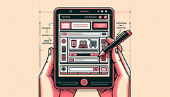
How to Stack Images on Mobile in Shopify with BemeApps
Understanding the Mobile Layout Challenge
In today's mobile-first world, ensuring that your Shopify store looks great on mobile devices is crucial. One common challenge that Shopify store owners face is adjusting the layout of images and text for mobile displays. Specifically, many users want to stack images on top of text when viewed on mobile devices, while maintaining a side-by-side layout on desktops.
Identifying the Problem
The problem arises when images and text, which are aligned side-by-side on desktop screens, do not adapt well to mobile screens. This can lead to a cluttered or awkward appearance on smaller devices, affecting user experience and potentially leading to lost sales.
Causes of the Layout Issue
- Responsive Design Limitations: While Shopify themes are designed to be responsive, they may not always handle specific layout requirements, such as stacking images on mobile, out of the box.
- CSS Flexbox Settings: The use of CSS flexbox can sometimes lead to rigid layouts that do not adapt as desired when screen sizes change.
- Lack of Mobile-Specific Styling: Without specific media queries targeting mobile devices, the default styles may not provide the desired layout adjustments.
Implementing a Solution
Step-by-Step Guide to Stack Images on Mobile
1. Review Your Current CSS
Begin by examining your existing CSS to identify the current flexbox settings and media queries. Look for any rules that define the layout of your images and text.
2. Add Mobile-Specific Media Queries
To achieve the desired stacking effect on mobile, you need to add or modify media queries in your CSS. Here's a simple approach:
@media screen and (max-width: 767px) {
  .ingredient-container.left,
  .ingredient-container.right {
    flex-direction: column;
    padding: 0;
  }
}
This code snippet ensures that the flex direction is set to column, stacking the images on top of the text for screens smaller than 768 pixels.
3. Test the Layout
After making changes, test your site on various mobile devices to ensure the images stack correctly and the text remains readable.
4. Adjust Text Size for Mobile
To prevent text from breaking awkwardly, adjust the font size using media queries:
@media screen and (max-width: 768px) {
  .ingredient-text h2 {
    font-size: 5vw;
    margin-top: 10px;
  }
  .ingredient-text li {
    font-size: 4vw;
    line-height: 1.5;
  }
  .buy-button {
    width: 80%;
    font-size: 4.5vw;
    padding: 15px;
  }
}
These adjustments ensure that text scales appropriately for smaller screens, enhancing readability and user experience.
Additional Considerations
Comparing Layouts
If you're curious about reversing the order so that images appear below the text, you can modify the flex-direction property:
@media screen and (max-width: 767px) {
  .ingredient-container.left,
  .ingredient-container.right {
    flex-direction: column-reverse;
    padding: 0;
  }
}
Ensuring Consistency Across Devices
While focusing on mobile, ensure that your desktop layout remains unaffected. Regularly test on both mobile and desktop to maintain a seamless experience.
Conclusion
By following these steps, you can effectively stack images on mobile devices in your Shopify store, improving the visual appeal and functionality of your site. Remember, a mobile-friendly design is key to retaining customers and boosting conversions.
Related Posts
- How to Fix Oversized Text and Buttons on Mobile in Shopify's Dawn ...
- How to Reduce LCP on Mobile with the Dawn Theme in Shopify
- Multi-collection Slider Not Displaying in Mobile View ... - BeMEApps
- How to Reduce LCP and FCP for Mobile Site Speed Improvement ...
- How to Reduce LCP on Mobile for Shopify's Dawn Theme
FAQs
Q: How can I ensure my Shopify store looks good on all devices? A: Use responsive design principles and test your store on multiple devices to ensure a consistent experience.
Q: Can I customize my Shopify theme to improve mobile layout? A: Yes, by modifying CSS and using media queries, you can tailor your theme to better suit mobile displays.
Author: BemeApps AI


