How to Fix a Resizing Issue with Your Shopify Store Logo on Mobile
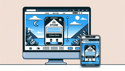
Understanding the Logo Resizing Problem on Mobile
In the world of eCommerce, maintaining a consistent brand image is crucial, and your logo plays a significant role in that. However, when customers access your Shopify store via their mobile devices, you might encounter the issue where your logo appears "squished" or improperly resized. This is a common problem for many Shopify users, where the logo looks perfect on the desktop but fails to adapt appropriately on mobile screens.
Why Is My Logo "Squished" on Mobile?
This issue generally arises due to CSS rules that are not properly targeted for mobile devices. Unlike desktop screens, mobile devices have different resolutions and screen sizes, which require adaptive CSS to ensure components like images, buttons, and logos maintain their intended proportions.
Common Causes:
- Fixed Width or Height: If the CSS specifies fixed dimensions for the logo, it might not adjust properly on different screen sizes.
- Media Queries: Lack of media queries targeting smaller screens might prevent the logo from resizing correctly.
- Theme Settings: Themes that do not allow for separate mobile customization could contribute to this issue.
How to Correct Your Logo's Size on Mobile Without Affecting the Desktop
To address this problem, we can apply selective CSS rules using media queries. This solution will explicitly target mobile devices and ensure your logo appears correctly, without altering its appearance on desktop versions.
Step-by-Step Solution:
-
Navigate to the Admin Dashboard:
- Log into your Shopify admin panel.
- Select
Online Storefrom the list on the left and click onThemes.
-
Edit the Code:
- Click on
Actionsnext to your active theme, and selectEdit Code.
- Click on
-
Locate the theme.liquid File:
- In the layout folder, find and click on
theme.liquid.
- In the layout folder, find and click on
-
Insert Adaptive CSS Code:
- Scroll to the bottom of the file, but ensure you add the CSS before the closing
</body>tag.
<style> @media screen and (max-width: 767px) { .image-wrapper img { height: 31px !important; /* Adjust as needed */ top: 4px !important; /* Optional: aligns the image */ } } </style>Explanation: The media query
@media screen and (max-width: 767px)targets devices with a screen width of 767 pixels or less, which includes most mobile phones. - Scroll to the bottom of the file, but ensure you add the CSS before the closing
-
Restrict CSS to Home Page (Optional):
- If you only want the changes to affect the home page, wrap the CSS with a liquid conditional:
{% if template == 'index' %} <style> @media screen and (max-width: 767px) { .image-wrapper img { height: 31px !important; top: 4px !important; } } </style> {% endif %} -
Save Changes and Test:
- Once you have added the code, click
Save. - Test your site on a mobile device to verify that the logo appears as desired without affecting the layout on other pages.
- Once you have added the code, click
Additional Troubleshooting Tips
If you still encounter issues, consider these troubleshooting steps:
- Check for Caching Issues: Clear the browser cache on your mobile device to ensure you're viewing the most recent changes.
- Responsive Images: Ensure that your logo file is an appropriate size and resolution for the web. Oversized images can cause additional mobile display issues.
Related Questions
Q1: What should I do if my logo is still not resizing properly after these steps?
Additional customizations might be required if you use apps or plugins affecting your storefront. Reviewing other CSS files within your theme might help identify conflicting styles.
Q2: How can I ensure all elements look perfect on both desktop and mobile?
Focus on responsive design principles—use flexible grid layouts, resize your media using CSS, and apply media queries to adjust elements for different screens.
By following the above guidelines, you can maintain a cohesive brand appearance across all devices, ensuring your customers have a seamless browsing experience whether accessed from a desktop or mobile device. Ensuring your eCommerce site is visually appealing on every platform boosts credibility and can lead to increased conversions.